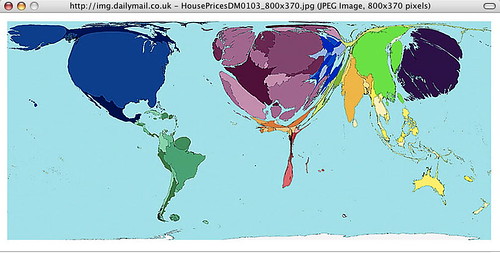
 This shows house prices around the world, and I "get" it.
Check out the Daily Mail link to see how the following are spread out over the world: alcohol consumption, HIV prevalence, house prices, military spending, war and death, toy imports, toy exports, the wealth of nations in 1500, and the wealth of nations in 2002.
Geography and political science teachers should be using this kind of visualization, IMHO, so students who are visual can understand even if they are numbers-blind.

1 comment:
Very cool.
Nice post.
Post a Comment