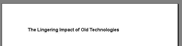
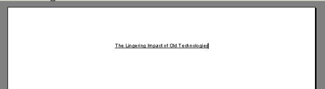
Which looks better, the underlined heading or the bolded and increased-size heading?
I insist my students use MS Word's Styles to set their headings. I further insist that they not underline their headings. When one student spoke up and complained that she had been taught to underline headings all the way through high school and she thought it looked better that way, I found myself explaining my reasons.
- Graphic designers generally agree that underlining doesn't look good or increase readability.
- Most people now associate underlining with linking on the web, not with headings.
And most importantly
- Underlining titles is a remnant of an antique technology - typewriters - where the only way you could signify that something was a heading was to move the paper backwards and add underlining to the words of the heading. You couldn't bold or increase the size; you could only underline.
So my student had had her eye trained to accept underlining as signifying a heading, and what she is actually signalling is that she isn't effectively using the flexibility of the new technology of word-processing to communicate visually. And people read this kind of information at a close to subconscious level, so she, and others, are actually signalling the lingering impact of typewriters and their resistance to learning the new technology of word-processing.
tags
word-processing
typewriters
headings

No comments:
Post a Comment